
The first set of commands is the same as what you would use to create a single graph. The result is your usual histogram. Be aware that the values you apply on the axis are going to be the same across all your histograms. Choose them appropriately so that the range on the axes is wide enough to see all the data. This forces you to think about whether data is comparable, comparing data with widely differing scales may not be the best idea.

adding by(category) creates a histogram for the distribution of your variable within each category. That means that you will have as many histograms as there are levels in your categorical variable. If it is binary, you should get two graphs. If it corresponds to countries, you would get about 200 histograms.

An important detail when working with side by side plots is that elements common to both plots, such as title and note, need to go inside the by() parentheses. Otherwise, a title will be added for each graph, creating a cluttered look.
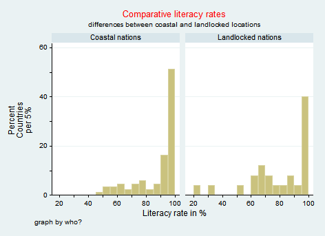
The label command allows you to specify the title of each histogram. The first line defines a new variable with names that correspond to each level of the categorical variable. Here 0 corresponds to coastal nations, and 1 to landlocked countries. The second line assign the created titles to the variable of choice. Here, the category is landlocked, so the newvar is assigned to landlock according to the predefined rule.
label define newvar 0"category 1" 1"category2"
label values category newvar